Mix, Stack, Own It: How Creators Are Building Whole Brand Identities Out of Remixed Clipart
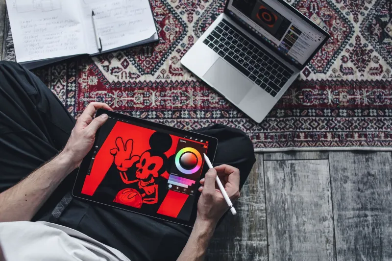
There's a move happening in the creator economy that design schools definitely didn't teach. Instead of hiring a branding agency or wrestling with expensive illustration software, a scrappy generation of entrepreneurs and content creators is doing something way more interesting — they're treating clipart like Lego bricks.
Not grabbing one cute graphic and calling it done. We're talking about pulling ten, fifteen, maybe twenty assets from a library, stripping them down, recoloring everything to match, layering pieces on top of each other, and building a visual language that feels completely cohesive and totally theirs. It's part design strategy, part creative hustle, and honestly? The results are kind of wild.
Why "One Graphic and Done" Doesn't Cut It Anymore
Here's the thing about using clipart as a one-off decoration: everyone can tell. Drop a generic star burst on a sale graphic and it reads as generic. But when a brand consistently uses the same remixed set of assets — tweaked florals in their signature dusty rose, custom-layered badge shapes in their exact color palette, illustrated characters that always wear the same hat — suddenly you've got visual identity. Suddenly people recognize you.
That recognition is what brand-building is actually about. And it used to cost a lot of money. Custom illustration packages from professional designers can run anywhere from $500 to several thousand dollars depending on scope. For a solo Etsy seller, a food blogger monetizing through brand deals, or a life coach building out a course business, that math doesn't work.
What does work? A solid clipart library, a free or affordable design tool like Canva or Adobe Express, and a clear-eyed strategy for how to use those assets consistently.
The Modular Mindset: Treating Assets Like a System
The creators who are doing this best have shifted how they think about clipart at a fundamental level. Instead of asking "what graphic goes with this post," they're asking "what are the five to eight visual elements that define my brand, and how do I pull those from a library?"
Think of it like building a capsule wardrobe. You're not buying a new outfit for every occasion — you're selecting core pieces that mix and match. Same idea here. A wellness brand might identify their visual building blocks as: a loose botanical illustration style, a specific hand-lettering vibe, circular frame shapes, and a muted earth-tone palette. Then they go into a clipart library and find assets that hit all four of those notes. They recolor everything to match. They layer a botanical sprig over a circle frame to make a logo mark. They use the same sprig, scaled down, as a bullet point in their email newsletter. They remix the frame shape into a story highlight cover. Same assets, multiple uses, consistent look.
That's the modular mindset. And it scales.
Recoloring Is the Secret Sauce Nobody Talks About
If there's one technique that separates creators who look polished from creators who look like they just grabbed random stuff off the internet, it's intentional recoloring. Most clipart ships in default colors — and those default colors are rarely anyone's brand colors.
The move is to import assets into your design tool and immediately swap every color to your own palette. Even if the original illustration was in twelve different shades, you're collapsing it down to your two or three brand colors. What comes out the other side looks like it was made for you, because in a very real sense, it now was.
Creators who've mastered this talk about it like a revelation. One independent stationery designer who sells on Etsy described going from "looking like everyone else" to getting messages from customers asking who her illustrator was — all from the same clipart files, just recolored and layered differently than anyone else was doing it.
Layering: Where the Real Magic Happens
Recoloring gets you halfway there. Layering takes you the rest of the way. When you start stacking clipart assets on top of each other — a texture behind an illustration, a frame around a character, a pattern overlaid at low opacity — you create compositions that genuinely don't look like off-the-shelf graphics anymore.
The key is learning which combinations work. Flat vector illustrations layer cleanly with geometric shapes. Hand-drawn style assets often pair well with subtle paper textures. Vintage-style clipart gets new life when layered with modern sans-serif type. None of this requires formal design training. It requires experimentation and a willingness to mess around until something clicks.
Design tools have made this more accessible than ever. Canva's layering features, Procreate's blend modes, even PowerPoint's arrange functions — the barrier to entry is genuinely low. What's not low is the creative thinking it takes to develop a consistent system. That part is real work. But it's the kind of work that pays off every single time you publish something.
Building Your Clipart Design System: Where to Start
If you want to start treating your clipart library as a brand system rather than a clip-and-paste convenience, here's a practical starting point:
Define your visual pillars first. Before you open any design tool, write down three to five words that describe how you want your brand to look and feel. Playful. Earthy. Bold. Minimal. Nostalgic. These words guide every asset decision you make.
Shop for a cohesive library, not individual files. Many clipart creators sell bundled sets with consistent illustration styles — florals, icons, patterns, frames — all drawn in the same hand. Buying a set like this gives you built-in visual consistency before you even start remixing.
Build a brand asset folder. Pull your recolored, approved assets into one folder. These are your building blocks. Every new piece of content you create pulls from this folder first.
Repeat elements intentionally. Use the same divider, the same corner accent, the same icon style across your website, your social graphics, your packaging, your email headers. Repetition is what builds recognition.
Evolve slowly. The temptation to refresh with new assets every season is real, but resist it early on. Let your visual identity build equity before you start swapping things out.
The Bottom Line
The creators who are winning with clipart right now aren't treating it like a shortcut. They're treating it like raw material — something to shape, combine, and own. The remixed brand identity isn't a compromise version of the real thing. Done right, it is the real thing.
Your brand doesn't need a $3,000 illustration package. It needs a smart library, a clear visual direction, and the willingness to put in the creative work of building something that looks unmistakably like you. The assets are out there. The only question is what you're going to build with them.