Fed Up With the Feed: Why Creators Are Using Clipart to Fight Back Against Cookie-Cutter Content Culture
Scroll through your Instagram feed on any given Tuesday and tell me what you see. Soft beige backgrounds. Sans-serif fonts that whisper rather than shout. Product shots that look like they were styled by the same algorithm that recommended them to you. Everything is clean. Everything is calm. Everything looks exactly the same.
Now tell me — do you remember any of it?
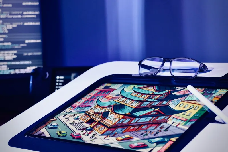
That's the problem a growing number of creators are naming out loud, and they've landed on a surprisingly retro solution: clipart. Not the dusty, ironic-use-only clipart of meme culture, but bold, personality-packed, illustrated graphic assets that scream "a human made this and a human chose this." It's become something of a quiet revolution, and the creators leading it are watching their engagement numbers go places the beige crowd can only dream about.
The Algorithm Wants You Boring
Here's the uncomfortable truth about platform algorithms in 2024: they were trained on what already performed well, which means they tend to reward content that looks like content that already performed well. It's a feedback loop that, over time, flattens everything into a kind of visual mush.
Design trends get amplified, copied, over-copied, and eventually absorbed into the background noise. The "clean aesthetic" that felt fresh in 2019 is now the wallpaper nobody notices. And when you can't be noticed, you can't build an audience — no matter how good your actual content is.
Creators who've figured this out aren't fighting the algorithm by gaming it. They're doing something more interesting: opting out of the visual language it optimized for entirely.
Clipart as Creative Protest
When Brooklyn-based illustrator and content creator Dani Reyes started swapping her minimal flat-lay photography for posts built around stacked, colorful clipart graphics, she expected a dip in performance. "I thought people would think I was being cheap or lazy," she says. "Instead, my saves went through the roof. People kept saying it felt like something they hadn't seen before."
That reaction — I haven't seen this before — is basically gold in a content landscape where everything has been seen before. And it's exactly what well-chosen, distinctive clipart delivers.
The key word there is distinctive. We're not talking about grabbing the first generic vector off a free site. Creators who are doing this well are being intentional about the style of clipart they use, building a visual vocabulary that feels cohesive and unmistakably theirs. Think thick outlines, saturated colors, slightly off-kilter proportions — illustration styles that have personality baked in.
"It's like the difference between wearing a uniform and getting dressed on purpose," says Tomas Guerrero, a Texas-based small business owner who creates content around his vintage resale brand. "The algorithm wants you in the uniform. I decided I'd rather stand out."
Why Imperfection Is the New Polish
There's a cultural undercurrent here worth naming. For years, "professional" in digital design meant smooth, symmetrical, and photorealistic. High production value was the goal. But audiences — especially younger ones — have developed a kind of allergy to that kind of perfection. It reads as corporate. It reads as manufactured. It reads as trying too hard to seem effortless.
Illustrated graphics, and clipart specifically, carry a different visual energy. They signal handcraft, even when they're digital. They imply that someone made a choice — a weird, specific, human choice — about how something should look. And in a media environment saturated with AI-generated images and templated design systems, that human fingerprint is genuinely rare.
This is why you're seeing illustrated aesthetics explode on platforms like Pinterest and Substack, where creators have a little more control over their presentation and audiences skew toward people actively seeking something different. The clipart-heavy newsletter or the illustrated brand identity isn't just a design trend — it's a trust signal.
Building a Visual Identity That Actually Sticks
One of the underrated advantages of building your content around a clipart-based visual system is consistency. Photography requires lighting, staging, editing, and a whole workflow that's hard to replicate exactly. Clipart assets, once you've built your library, are endlessly remixable and always on-brand.
Creators who've gone this route describe it as finally having a design language that travels — from their Instagram grid to their email headers to their digital products and merch. "I used to feel like my brand looked different everywhere," says lifestyle creator Priya Nair, based out of Chicago. "Now everything looks like me, whether it's a story graphic or a PDF I'm selling. That consistency is doing a lot of work."
The practical upside is real too. When you're not reshooting content every time you need a new post, you free up serious creative bandwidth. That time goes back into the actual content — the writing, the ideas, the things that made people follow you in the first place.
The Engagement Spike Is Real
Okay, let's talk numbers, because that's ultimately what keeps the lights on for creators.
Across the board, creators who've made the switch to bold, illustration-heavy aesthetics report similar patterns: an initial period of uncertainty, followed by a noticeable uptick in saves, shares, and direct messages from followers who say they recognized the content immediately. That recognition factor — the sense that a follower can spot your post before they even see your handle — is the kind of brand equity that compounds over time.
It makes sense when you think about it. If your content looks like everything else, the only thing driving someone to engage is the content itself. But if your content has a distinctive visual identity, you're building recognition on top of the content value. You're easier to remember, easier to recommend, and harder to scroll past.
How to Start Without Overthinking It
If you're feeling the pull toward this approach but not sure where to start, here's the honest advice: pick a style, not a single asset. Find a clipart collection that has a consistent visual voice — a particular illustration style, a color palette, a line weight — and build from there. Mix and layer. Repeat elements across posts. Let the visual repetition do the work of building recognition.
And don't be afraid of being a little loud about it. The whole point is to stop blending in. If your first instinct is "this feels like a lot," you're probably on the right track.
The feed is full of people trying to look professional. What it's desperately short on is people who look like themselves.
Clipart, of all things, might be the most honest design choice you make all year.